
The 2025 season of F1 has come with some amazing special liveries. From slight changes to a complete rebrand – they are beyond beautiful, at least most of them…
From time to time, the design team misses. Here are the best of the best and the worst from this season so far.
The Best of 2025
The majority of liveries are gorgeous, they show creativity, personality and are just fun or nice to look at. All of these come from the very beginning in Japan all the way up to the British race.
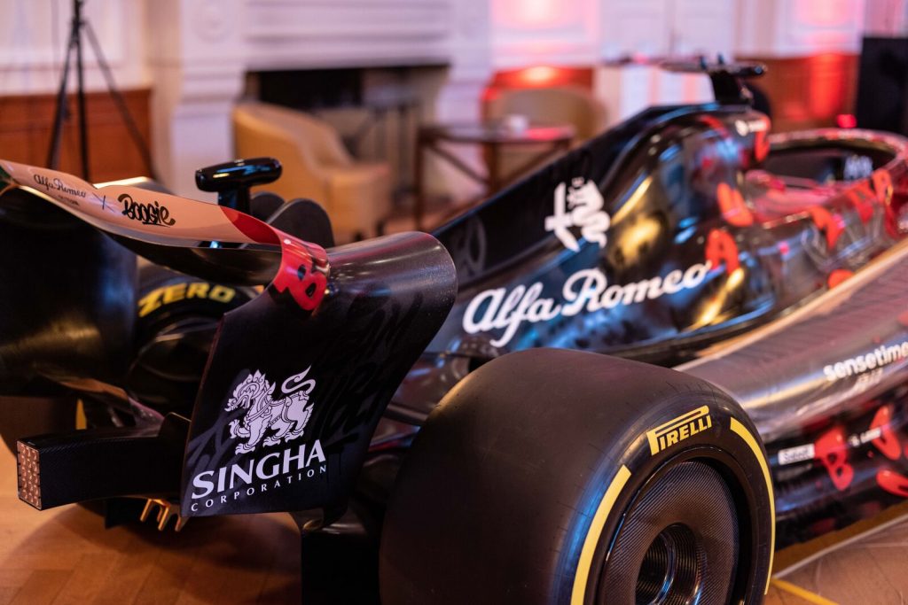
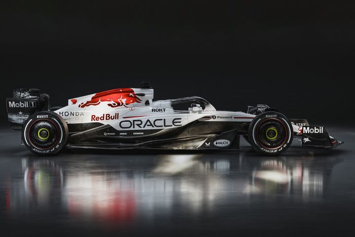
Haas + Red Bull Racing: Suzuka
Both Haas and Redbull’s liveries didn’t disappoint. They are very different from each other, yet both stood out during the Suzuka race.
Red Bull went for a sleek red and white look, bringing the old Honda- tribute design out. Last seen at the Turkish Grand Prix 4 years ago, fans loved it. Of course they had to bring it back.
Haas used the cherry blossom flower as their base design. It was gorgeous to look at and very fitting for the Japanese setting. The only thing that wasn’t massively liked was the fact that they kept the red Haas
whilst having a pink car.
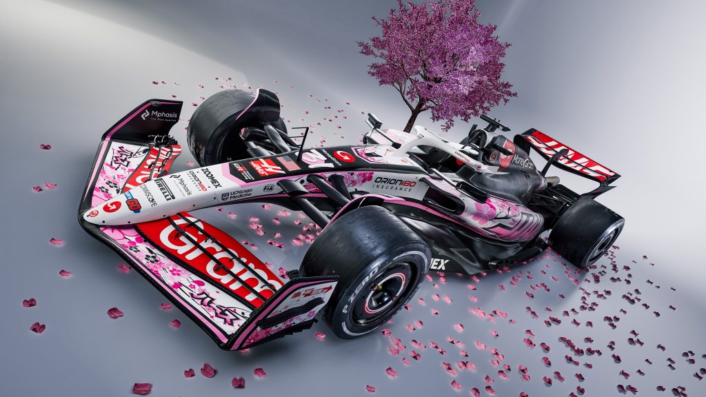
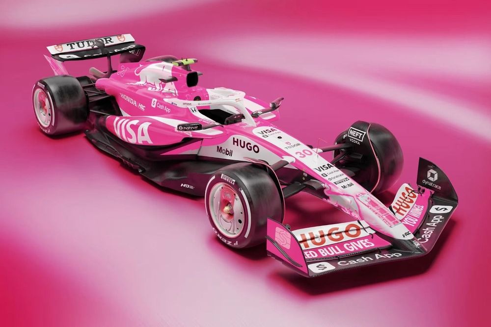
Sauber + VCARB: Miami
Again, they are very different. Many may disagree with the Sauber inclusion; however, it was a nice change from the solid green.
VCARB was amazing. Fully pink and the details were to die for. It was fresh, clean and something new! Very refreshing to see on the grid. The details were also very thought out; the wheels had Red bull can lids on them to promote the new summer flavour. All in all, perfection.
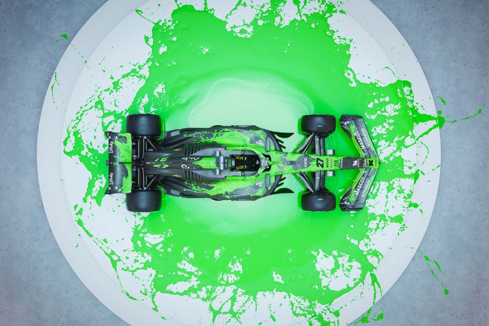
Sauber is a tough one. They went with their traditional colours but switched it up a bit. You could see the details of the “slime” and “paint” pattern. It was good to see something different.
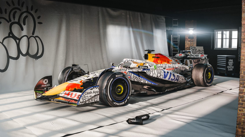
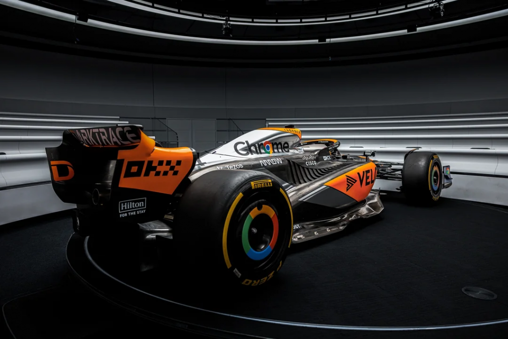
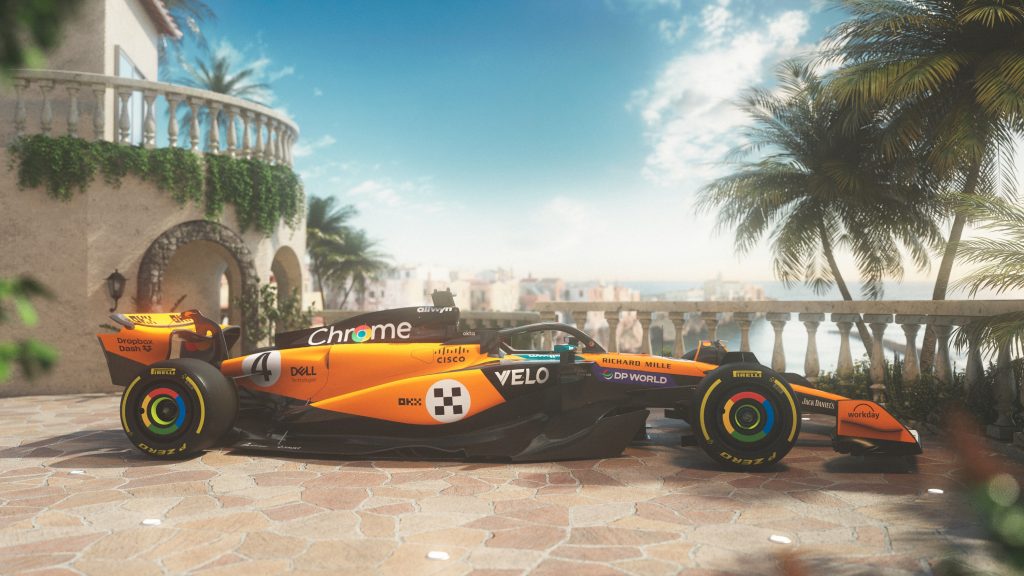
VCARB + McLaren: Silverstone
Once again, VCARB makes this list. The McLaren addition may shock some, however, it seems appropriate to add due to its subtle changes.
VCARB went for a an abstract design on the car, with it looking very graffiti-esque. Regardless, its design was very nice on the eyes and still had the original Racing Bull feel to it. An amazing livery.
McLaren doesn’t really step out of its orange box, although it had some chrome highlights and focused on the Chrome sponsorship. This is a very good concept and hits their marketing all at once. It showed a bit of change, and it was cool.
The Worst of 2025
Now we get to the worst ones of 2025. This doesn’t mean they are necessarily bad, just less appealing than the other designs. Let’s get into the list!
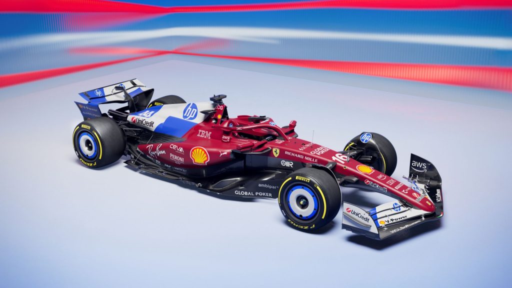
Ferrari: Miami
Possibly one of the worst rated liveries in the past few years. Fans were not pleased when they saw this, and the official posts comments had to be limited. Combined with the racing suits, it was bad. Very bad. It
seemed like the essence of Ferrari was lost, and HP just took over.
McLaren: Monaco
It was not ugly by any means. It was very simple, classic and got the job done. However, it just didn’t impress anyone. It wasn’t a massive change up from McLaren’s usual style, and that is the purpose of special livery. Not bad but not excellent.
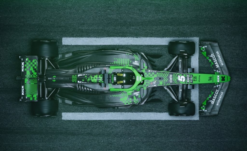
Sauber: Barcelona
Once again, it wasn’t ridiculously ugly. It was just very plain and seemed like a rehash of ideas. The black base took over, and the green pixel-look was scarce. Overall, just not very different, and didn’t catch many eyes. It was definitely very Kick Sauber.
Overall, there were some hits as well as some misses. However, the majority were amazing! Every year, fans are beyond excited to see what the teams produce. Currently, we are waiting on the official liveries (not special) for Cadillac and Audi.
We are more than halfway through the season and people are putting in their predictions for the World Champion already. What do you think?
Do you agree with this list? Let us know your favourite special livery!